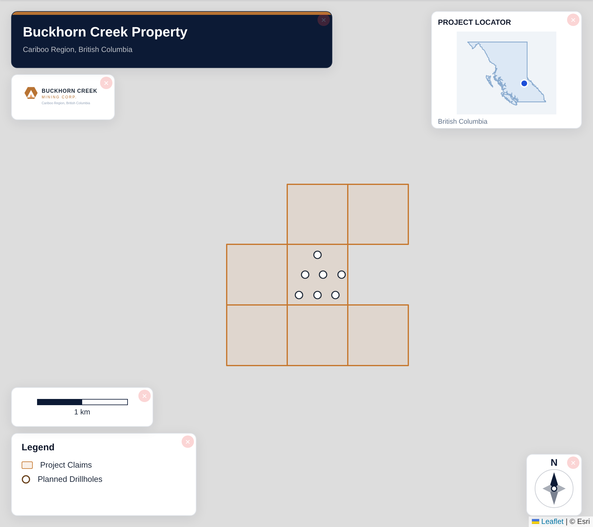
A mining claim map needs: styled claim boundaries, claim labels, a title block with project/company/date, a legend, scale bar and north arrow, geographic context (roads, water, place names), a location inset, and a registry-verification note. That combination makes it readable, credible, and safe to share.
Turn public claim data into a clean map.No GIS experience needed — import, style, and export in minutes.
Claim boundaries — the subject, styled conventionally
Claim labels — tenure numbers or block names
Title block — project, company, date
Legend — every symbol explained
Scale bar + north arrow
Geographic context — roads, water, towns at low opacity
Location inset — where in the province/state this sits
Registry note — where the data came from and when
Boundaries: the one hard line
Claims are the legal spine of the map — style them so nothing competes: the conventional treatment is a solid boundary with a light fill. If the property has multiple claim blocks or partners, colour by block/owner and let the legend explain.
Labels: connect map to paperwork
Label claims with tenure numbers (technical audiences) or block names (investor audiences). Unlabelled polygons force readers to cross-reference a table — label the map and the figure stands alone.
Boundaries, labels, and a legend — the core of a claim map that stands alone.
Title block and date: the credibility markers
Project name, company, and — critically — a date. Tenure changes monthly; an undated claim map is unusable to anyone careful. The date tells readers exactly how current the picture is.
Scale, north, legend, context, inset
These five turn a shape-drawing into a map: scale bar and north arrow orient it; the legend decodes it; low-opacity roads/water/towns place it locally; the inset places it regionally. All are toggles in the Design section — there's no excuse for a figure missing them.
The note almost everyone forgets
Say where the boundaries came from
Add a footer note: source registry and retrieval date, plus 'verify current tenure with the official registry'. E.g. 'Claim boundaries: BC Mineral Titles Online, retrieved 2026-07-06. Not an official tenure record.' It protects you, and sophisticated readers look for it.
Import your file and export an investor-ready map.Open the editor and have a shareable map in minutes.
Should I show expired or pending claims on the map?
Only with distinct styling and a legend entry — e.g. dashed grey for 'application pending'. Mixing expired ground into a solid claims layer misrepresents the holding; when in doubt, map active tenure only.
What colour should claim boundaries be?
There's no rule, but the readable convention is a strong boundary colour (blue/red) with a light fill of the same hue at low opacity. On satellite basemaps, use white or a bright colour for contrast.
Do I label every claim or just blocks?
Scale decides. A 10-claim property: label each tenure number. A 300-cell land package: label named blocks and provide the full tenure list in an accompanying table — 300 numbers on one figure is noise.
What goes in the legend of a claims-only map?
Even a single-layer map benefits from a legend entry ('Mineral claims — Company X') plus entries for context layers if shown. If claims are coloured by owner or block, the legend is where that coding is explained.
Is a claim map from public registry data accurate enough to publish?
For presentations and releases, yes, with the source-and-date note and registry verification of anything material. For legal or transaction purposes, always work from official registry records — public GIS layers can lag.